
This modest little book published by the Swedish Architecture Museum has one rather striking feature. The cover has a pop-out section that can be folded to create a 3D model of a building, which looks to be a traditional Scandinavian house with a steeply pitched roof. A unique feature such as this can broaden the appeal of a book that is, by way of its subject matter, targeted at a specialist interest group. The book just might, for instance, be purchased as a tourist souvenir.
Ways of Seeing – John Berger (BBC and Penguin, 2008)
 This book is a reissue by the BBC and Penguin Books of a book originally published in 1972 as an accompaniment to a BBC television series. The book, which is based on the scripts Berger wrote for the TV series, is comprised of seven essays and has been used extensively as a text in academic institutions. The challenges Berger poses to traditional Western art criticism in this book are reflected in challenges to book design conventions in its execution.
The cover is interesting because it is in fact the first page of the text. The reader starts here and upon opening the book simply continues reading on the first page.
I may discuss this book more than once because it's rather intriguing. It seems to me that the purpose of flaunting convention in this book is to embody the nature of its content and to challenge the reader to rethink the process of reading. In that sense it is successful.
I may discuss this book more than once because it's rather intriguing. It seems to me that the purpose of flaunting convention in this book is to embody the nature of its content and to challenge the reader to rethink the process of reading. In that sense it is successful.
The Endless City (Phaidon, 2007)
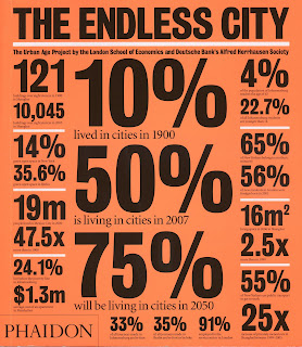
Phaidon makes statistics look cool in bold black type on a neon orange background. It's busy, but it works because of the regularity of shapes and contrasting white accents.
The Summer Without Men – Siri Hustvedt (Sceptre, 2011)

This is a very nicely designed cover. It's simple and uncluttered, but has an enticing subtlety about it. The minimalism is reminiscent of poetry book design, yet this is a literary novel. It has a lightness to it that belies its subject matter. The use of blank space on the cover suggests that this is a novel where those things left unrepresented are as important as what is directly conveyed. The woman's skin and hair, for example, is rendered boldly in black and red, yet her dress and her body are merely suggested through the negative space. It requires the reader's interpretation – as does the text.

The cover is made from a matt board and has generous flaps. It seems odd that the quality of the cover has not been carried through to the internals of the book. It is printed on recycled stock, which is very thin and quite coarse. The text of subsequent pages is visible, as can be seen here, which might affect its readability and does feel a bit cheap. However, the book is actually quite pleasingly light in weight.


Phaidon makes statistics look cool in bold black type on a neon orange background. It's busy, but it works because of the regularity of shapes and contrasting white accents.
The Summer Without Men – Siri Hustvedt (Sceptre, 2011)


The cover is made from a matt board and has generous flaps. It seems odd that the quality of the cover has not been carried through to the internals of the book. It is printed on recycled stock, which is very thin and quite coarse. The text of subsequent pages is visible, as can be seen here, which might affect its readability and does feel a bit cheap. However, the book is actually quite pleasingly light in weight.
Housekeeping – Marilynne Robinson (Faber & Faber, 2005)
I had to find a way to incorporate this book into this exercise somehow. Given that on the whole the edition I own is not exactly a stunning example of book design, it fell to the cover to make a statement. It's a quiet sort of statement. One that says something to the effect of 'if you'd like to read an introspective and rather melancholy story, this is the book for you'.

A dark, empty railway track trails towards a foreboding mist into which the text is sinking. The monochromatic palette of the image is set off by the fuschia pink title. This works nicely to highlight the opposition between the exteriority of the image and the domesticity of the title.
The review material doesn't overwhelm. The Guardian review quote sits comfortably within the image and the Observer mention at the top does its job tidily against the neutral background.
This is starting to sound a bit far-fetched – a good stopping point I think ...


