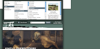
Te Ara: The Encyclopedia of New Zealand – www.teara.govt.nz (Screenshots taken 23 July 2011)
Te Ara is really interesting as an example of the transition between the display of information for print and information for the web. The design and navigability has been carefully thought through and its pretty user-friendly. Soon, however, a re-design is being implemented to improve usability and update the site to current web trends. This discussion is simply a brief overview of some of the design elements as they are currently – I'll note what's changing where I remember.
Traditionally, print encyclopedias have divided information into topic categories. Te Ara essentially does the same, but its divisions are called themes and they have a different focus to traditional encyclopedias.
Shown here is a screenshot of a section of the Te Ara homepage – this is the starting point for exploring the themes. This is a pretty busy-looking page. There are so many competing elements that it's not immediately clear that the main content is found by clicking through the small thumbnails. The look of this page will change significantly after the re-design is implemented.
Shown here is the Social Connections theme main page, which uses the same thumbnail design to link to the sub-themes, such as Health and Crime.
Shown here is the Religion sub-theme main page, which again follows the thumbnail link design to list the topics under that theme.
The user can then click through to a topic main page, such as the Missions and missionaries page shown here. This includes a blurb about the whole topic to the left of the page, plus a main image and thumbnail links to sub-topics.
Te Ara also has an index of sorts, which can be accessed from any page through the tab labelled 'Browse Te Ara'. This tab isn't very noticeable on the page, and the system of indexing is also not entirely effective. This is one element that will be changed in the re-design.
The text on Te Ara is designed to be web-friendly. For instance, Te Ara uses a a down-style of capitalisation on the site because caps are less easily read on screen.


No comments:
Post a Comment