
The entire text of this book is set in a bold, sans serif type (Univers 65). The book's designer, Richard Hollis, says on his website that the intention behind this was ‘to match the visual weight of the illustrations’ (www.richardhollis.com/book-design/ways-of-seeing). I suspect this might have a limiting effect on readibility, but, well, I haven't read the book, so I don't know exactly.
Very Swiss-minimalist ... still cool in the 21st century? Probably – in the same way as fondue.
The Hare and the Tortoise – Helen Ward (Templar Publishing, 1998)

This example could have come from any children's book really – that's where the fun's to be had – hurtling the type all over the page, causing havoc. Easy to do, of course, when there's only one line of it ...
Infinite Jest – David Foster Wallace (Abacus, 2009)

Bringhurst says of text that, 'Its tone, its tempo, its logical structure, its physical size, all determine the possibilities of its typographic form.' To this end he advocates that a typographer read the text before setting it.
When I look at this book and feel the weightiness of its 1,067 pages in my hand (for I have not actually read it, you see), I am convinced that the person responsible for typesetting this book did in fact read it. Because I wonder, is the 'infinite jest' that this book is so illegible it's not actually meant to be read?
The Pinstriped Prison – Lisa Pryor (Picador, 2008)

The majority of the text in this book is set in a perfectly acceptable serif typeface, but here and there it's punctuated by these information pages. It probably was a good idea to set them in a sans serif type to set them apart, but this is just a yucky combination of typefaces. Actually, looking at the book again, it does use that first font for the running headers and folios throughout, so at least there's consistency in the ugliness. The large leading is a bit obvious too.
Culinaria Italy: Pasta, Pesto, Passion – Claudia Piras (Ullmann & Könemann, 2004)
This book aspires to great things, but it's really let down by its design. It's meant to be an authority on Italian cuisine culture and while it undoubtedly holds a wealth of great information within its 500 pages, that information is near inaccessible to the reader. This designer clearly hasn't encountered Bringhurst ...
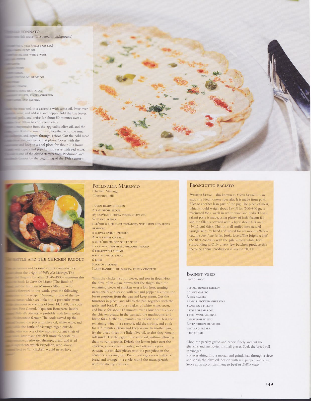 Obviously the major problem in this example is the point size of the type, which I think is probably only about 6 or 7. This is simply too small when the intended functionality is as a cookery book. This surely leads to all kinds of mishaps in the kitchen. It seems that perhaps one solution to this was thought to be in listing the ingredients in caps, but I would argue that where all caps are used with such a small point size it simply exacerbates the problem. The instructions in the recipes are also inconsistently paragraphed – some are given that luxury, but others not.
And while not strictly a typographical error, the 'Vitello Tonnato' recipe at top left suffers greatly from the fact that it is set within a translucent white box on an illustrated background.
No comments:
Post a Comment