Showing posts with label Internal layout. Show all posts

Let's get digital

Te Ara: The Encyclopedia of New Zealand – www.teara.govt.nz (Screenshots taken 23 July 2011)

Te Ara is really interesting as an example of the transition between the display of information for print and information for the web. The design and navigability has been carefully thought through and its pretty user-friendly. Soon, however, a re-design is being implemented to improve usability and update the site to current web trends. This discussion is simply a brief overview of some of the design elements as they are currently – I'll note what's changing where I remember.

Traditionally, print encyclopedias have divided information into topic categories. Te Ara essentially does the same, but its divisions are called themes and they have a different focus to traditional encyclopedias.

Shown here is a screenshot of a section of the Te Ara homepage – this is the starting point for exploring the themes. This is a pretty busy-looking page. There are so many competing elements that it's not immediately clear that the main content is found by clicking through the small thumbnails. The look of this page will change significantly after the re-design is implemented.

Shown here is the Social Connections theme main page, which uses the same thumbnail design to link to the sub-themes, such as Health and Crime.

Shown here is the Religion sub-theme main page, which again follows the thumbnail link design to list the topics under that theme.


The user can then click through to a topic main page, such as the Missions and missionaries page shown here. This includes a blurb about the whole topic to the left of the page, plus a main image and thumbnail links to sub-topics.

Te Ara also has an index of sorts, which can be accessed from any page through the tab labelled 'Browse Te Ara'. This tab isn't very noticeable on the page,  and the system of indexing is also not entirely effective. This is one element that will be changed in the re-design.

The text on Te Ara is designed to be web-friendly. For instance, Te Ara uses a a down-style of capitalisation on the site because caps are less easily read on screen.

The lay of the page

'A page, like a building or room, can be of any size and proportion, but some are distinctly more pleasing than others, and some have quite specific connotations.'

The Elements of Typographic Style – Robert Bringhurst

I've chosen to show only non-fiction and reference books here because these were the most interesting layout examples that I could find. Fiction page layout seems generally to be conventional – but no doubt there are some great exceptions.

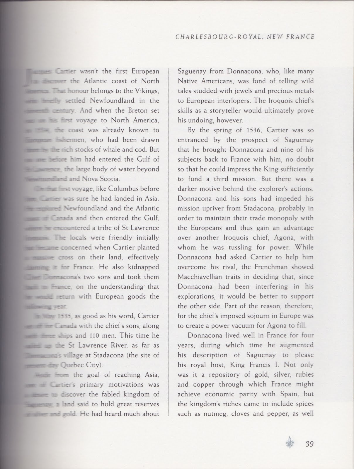
Ghost Colonies: Failed utopias, forgotten exiles and abandoned outposts of empire – Ed Wright (Pier 9, 2009)


The dimensions of this book are unusual. It measures 185 x 228 mm and is thus relatively wide in relation to its height. An elegant two-column option has been used for the main text grid, as shown above. The top margin is also generous to allow ample space for the running headers. In my opinion this is a successful solution for non-fiction narrative text. The short measure allows the reader to comfortably digest information, but it can also be read without significant interruption.

There are sections of the book, not shown here, where the text has been set in one column in order to emphasise information that is not part of the main text. In these instances, the outer margin has been increased significantly so as to avoid an excessively long measure.


Collins Gem English Dictionary (HarperCollins, 2001)

This basic, pocket-sized dictionary is, by contrast, of very modest dimensions (75 x 115 mm). It also uses a two column grid; however, the margins have been compromised to the last degree.

This is not to say that the page is particularly displeasing to the eye and it is certainly not unsuitable to the type of information it houses. The typographical choices (offsetting text using roman, bold and italics) lead to a well balanced result.


Cod: A Biography of the Fish That Changed the World – Mark Kurlansky (Vintage, 1999)

This book is thoroughly engaging and reads rather like fiction and seems designed as such. Its design is also a clear example of how keeping to convention sometimes just is the best solution. The bottom margin is the largest, being approximately one and a half times the size of the top. One can comfortably sit one's thumbs there when holding the book to read (a design guru said this was desirable, but sadly I've forgotten who that might have been).


I do wonder whether I would have so readily devoured a book about the history of the world's cod fisheries had the text been squeezed into a tight grid without room to breathe.


Roosters I Have Known – Steve Braunias (Awa Press, 2008)

A tidy format – Penguin Classic-like. I do think though that the text on the page has been compromised the littlest bit too much. The book is quite stiff and consequently the text slips into the gutter a little and it is a bit uncomfortable to read.


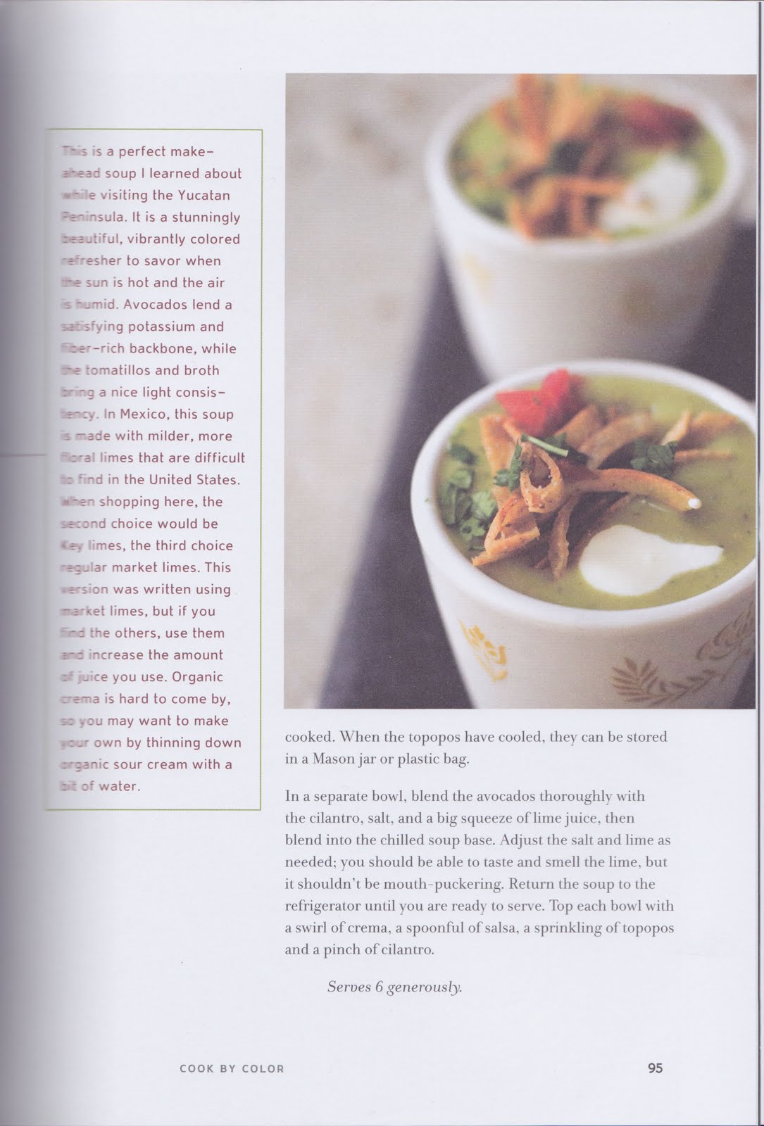
Super Natural Cooking – Heidi Swanson (Celestial Arts, 2007)


This cookbook has an interesting and flexible grid. These images show a recipe that sits across a two-page spread. A fair amount of information is displayed here, yet the pages are well balanced with generous white space. Throughout the book, a series of flexible text blocks are used to display different textual elements, which are shifted around the page to suit the amount of information being displayed.


Sprawltown: Looking for the city on its edges – Richard Ingersoll (Princeton Architectural Press, 2006)


Finally, here's a book that works at the boundaries of conventional layout. The top and outside margins are minimal relative to the bottom and gutter margins. I imagine this has been done to reflect the book's subject matter, as communicated by the title. It feels as if the text has been manually pushed up and outwards from the middle to the edges. Running heads have been omitted, but folios are located on the bottom outside corner of the pages (outside the scanner area).