Showing posts with label Fiction. Show all posts

Judging a book by the cover

Architecture in Sweden: Function, Design and Aesthetic through the Ages (Arkitekturmuseet, 2007)


This modest little book published by the Swedish Architecture Museum has one rather striking feature. The cover has a pop-out section that can be folded to create a 3D model of a building, which looks to be a traditional Scandinavian house with a steeply pitched roof. A unique feature such as this can broaden the appeal of a book that is, by way of its subject matter, targeted at a specialist interest group. The book just might, for instance, be purchased as a tourist souvenir.


Ways of Seeing – John Berger (BBC and Penguin, 2008)

This book is a reissue by the BBC and Penguin Books of a book originally published in 1972 as an accompaniment to a BBC television series. The book, which is based on the scripts Berger wrote for the TV series, is comprised of seven essays and has been used extensively as a text in academic institutions. The challenges Berger poses to traditional Western art criticism in this book are reflected in challenges to book design conventions in its execution.

The cover is interesting because it is in fact the first page of the text. The reader starts here and upon opening the book simply continues reading on the first page.

I may discuss this book more than once because it's rather intriguing. It seems to me that the purpose of flaunting convention in this book is to embody the nature of its content and to challenge the reader to rethink the process of reading. In that sense it is successful.


The Endless City (Phaidon, 2007)
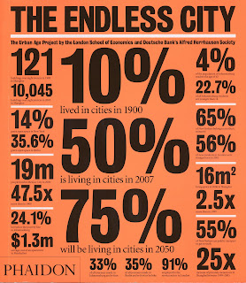

Phaidon makes statistics look cool in bold black type on a neon orange background. It's busy, but it works because of the regularity of shapes and contrasting white accents.


The Summer Without Men – Siri Hustvedt (Sceptre, 2011)


This is a very nicely designed cover. It's simple and uncluttered, but has an enticing subtlety about it. The minimalism is reminiscent of poetry book design, yet this is a literary novel. It has a lightness to it that belies its subject matter. The use of blank space on the cover suggests that this is a novel where those things left unrepresented are as important as what is directly conveyed. The woman's skin and hair, for example, is rendered boldly in black and red, yet her dress and her body are merely suggested through the negative space. It requires the reader's interpretation – as does the text.


The cover is made from a matt board and has generous flaps. It seems odd that the quality of the cover has not been carried through to the internals of the book. It is printed on recycled stock, which is very thin and quite coarse. The text of subsequent pages is visible, as can be seen here, which might affect its readability and does feel a bit cheap. However, the book is actually quite pleasingly light in weight.


Housekeeping – Marilynne Robinson (Faber & Faber, 2005)

I had to find a way to incorporate this book into this exercise somehow. Given that on the whole the edition I own is not exactly a stunning example of book design, it fell to the cover to make a statement. It's a quiet sort of statement. One that says something to the effect of 'if you'd like to read an introspective and rather melancholy story, this is the book for you'.

A dark, empty railway track trails towards a foreboding mist into which the text is sinking. The monochromatic palette of the image is set off by the fuschia pink title. This works nicely to highlight the opposition between the exteriority of the image and the domesticity of the title.

The review material doesn't overwhelm. The Guardian review quote sits comfortably within the image and the Observer mention at the top does its job tidily against the neutral background.

This is starting to sound a bit far-fetched – a good stopping point I think ...

It's in the fine imprint

Designing children's books really must be a fun job. Certainly the best examples of designers going a bit wild with the imprint page of all things were in kids' books, such as:

The Three Fishing Brothers Gruff – Ben Galbraith (Hodder Children's Books, 2006)

Here the text has been shaped to look like splashes and bubbles of water in keeping with the story. A page containing publication information wouldn't normally be of interest to young readers, but this page is effectively a visual extension of the story.


The Video Shop Sparrow – Joy Cowley & Gavin Bishop (Mallinson Rendell, 2000)

This book similarly incorporates the imprint page as an illustration element. The information is placed within a box on the front of a building as if it is part of the signage.


For all that fun, however, when it comes to 'grown up' books, there's much to be said for achieving a simple sense of proportion and balance in the display of this information on the page. I admire the two following examples:


Atlas of Remote Islands: Fifty Islands I have not visited and never will – Judith Schalansky (Particular Books, 2010)


Ghost Colonies: Failed utopias, forgotten exiles and abandoned outposts of empire – Ed Wright (Pier 9, 2009)

On T y p o g r a p h y

Ways of Seeing – John Berger (BBC & Penguin, 2008)


The entire text of this book is set in a bold, sans serif type (Univers 65). The book's designer, Richard Hollis, says on his website that the intention behind this was ‘to match the visual weight of the illustrations’ (www.richardhollis.com/book-design/ways-of-seeing). I suspect this might have a limiting effect on readibility, but, well, I haven't read the book, so I don't know exactly.

Very Swiss-minimalist ... still cool in the 21st century? Probably – in the same way as fondue.


The Hare and the Tortoise – Helen Ward (Templar Publishing, 1998)


This example could have come from any children's book really – that's where the fun's to be had – hurtling the type all over the page, causing havoc. Easy to do, of course, when there's only one line of it ...


Infinite Jest – David Foster Wallace (Abacus, 2009)


Bringhurst says of text that, 'Its tone, its tempo, its logical structure, its physical size, all determine the possibilities of its typographic form.' To this end he advocates that a typographer read the text before setting it.

When I look at this book and feel the weightiness of its 1,067 pages in my hand (for I have not actually read it, you see), I am convinced that the person responsible for typesetting this book did in fact read it. Because I wonder, is the 'infinite jest' that this book is so illegible it's not actually meant to be read?


The Pinstriped Prison – Lisa Pryor (Picador, 2008)


The majority of the text in this book is set in a perfectly acceptable serif typeface, but here and there it's punctuated by these information pages. It probably was a good idea to set them in a sans serif type to set them apart, but this is just a yucky combination of typefaces. Actually, looking at the book again, it does use that first font for the running headers and folios throughout, so at least there's consistency in the ugliness. The large leading is a bit obvious too.


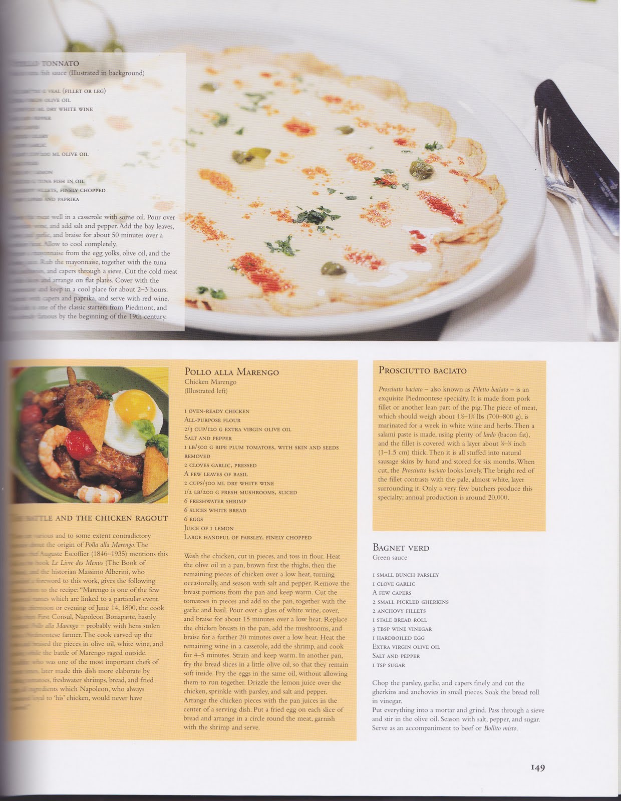
Culinaria Italy: Pasta, Pesto, Passion – Claudia Piras (Ullmann & Könemann, 2004)

This book aspires to great things, but it's really let down by its design. It's meant to be an authority on Italian cuisine culture and while it undoubtedly holds a wealth of great information within its 500 pages, that information is near inaccessible to the reader. This designer clearly hasn't encountered Bringhurst ...

Obviously the major problem in this example is the point size of the type, which I think is probably only about 6 or 7. This is simply too small when the intended functionality is as a cookery book. This surely leads to all kinds of mishaps in the kitchen. It seems that perhaps one solution to this was thought to be in listing the ingredients in caps, but I would argue that where all caps are used with such a small point size it simply exacerbates the problem. The instructions in the recipes are also inconsistently paragraphed – some are given that luxury, but others not.

And while not strictly a typographical error, the 'Vitello Tonnato' recipe at top left suffers greatly from the fact that it is set within a translucent white box on an illustrated background.

The view from behind

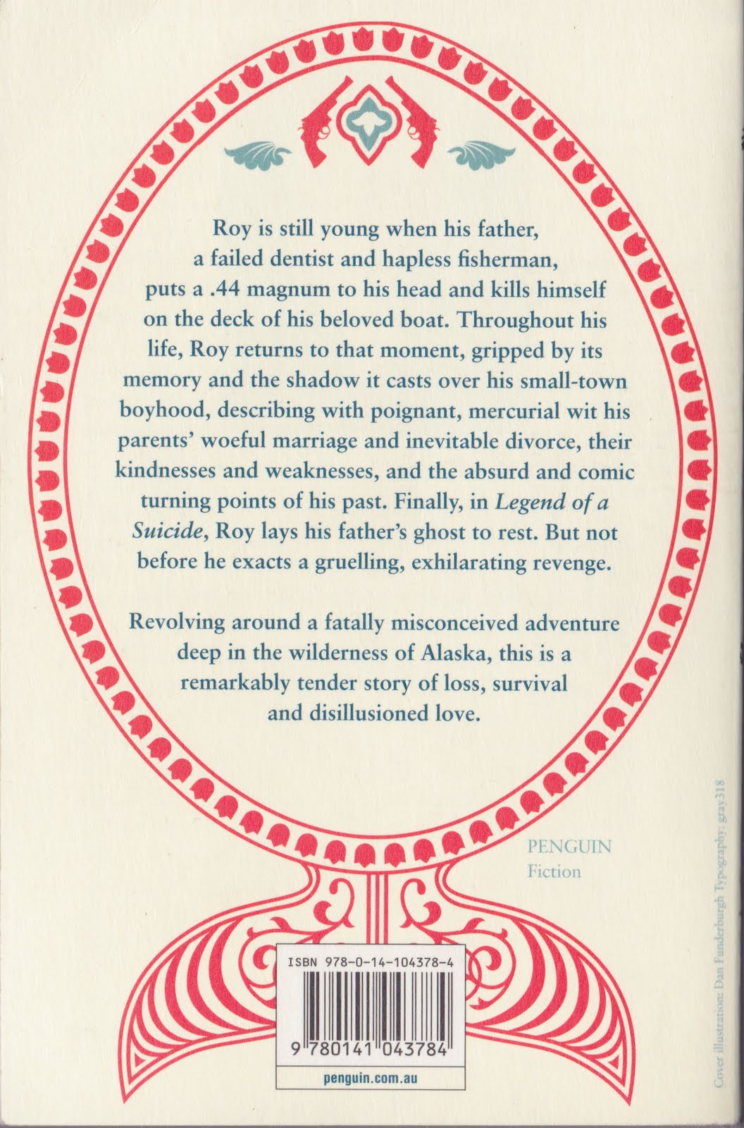
Legend of a Suicide – David Vann (Penguin, 2008)

This book has a gorgeous front cover with blue and red embossed foil type and an image of a stylised fish decorated with a pattern of abstract shapes and mini pistols – the only element that has any relationship to the word 'suicide' in the title. The opulent foil has been done away with for the back cover, but the fish motif is repeated and acts as a frame for the blurb to sit within. This has the effect of creating a pleasing balance between text and image within the boundaries of the cover. The burden of the barcode weighs heavily on the fish's tail however.


Ghost Colonies: Failed utopias, forgotten exiles and abandoned outposts of empire – Ed Wright (Pier 9, 2009)


I really like this back cover too. The use of a full image background is successful as there are then not a great number of competing elements on the cover. The image sits behind and the blurb can do its work. Spot lamination, which is also used to highlight the text on the front cover, is used here for the boxed blurb and helps it to pop out from the muted, matt image.


Anno Domini 2000 or Woman's Destiny – Julius Vogel (Exisle Publishing, 2000)


Horrendous! Bullet points for fiction – so very bad. This is most certainly not a great work of literature, so it might be a bit disingenuous to write a tantalising blurb about the plot of this book because the reader would feel pretty cheated upon reading. The book is interesting for the ideas behind it, however, so I'd concede that describing Vogel's visions on the back cover is the probably the most appropriate approach to content there. But it remains that the two columns of bullet points are a poor display choice – not in the least because the bottom two points get lost in the encroaching image. The choice of typefaces also feels wrong, particularly as inside the book several pages of the original edition of 1889 are replicated, which makes it feel historical. I think that a much more attractive book would have resulted overall if this idea had been followed throughout.